This is default featured slide 1 title

Go to Blogger edit html and find these sentences.Now replace these sentences with your own descriptions.This theme is Bloggerized by Lasantha Bandara - Premiumbloggertemplates.com.

This is default featured slide 2 title

Go to Blogger edit html and find these sentences.Now replace these sentences with your own descriptions.This theme is Bloggerized by Lasantha Bandara - Premiumbloggertemplates.com.

This is default featured slide 3 title

Go to Blogger edit html and find these sentences.Now replace these sentences with your own descriptions.This theme is Bloggerized by Lasantha Bandara - Premiumbloggertemplates.com.

This is default featured slide 4 title

Go to Blogger edit html and find these sentences.Now replace these sentences with your own descriptions.This theme is Bloggerized by Lasantha Bandara - Premiumbloggertemplates.com.

This is default featured slide 5 title

Go to Blogger edit html and find these sentences.Now replace these sentences with your own descriptions.This theme is Bloggerized by Lasantha Bandara - Premiumbloggertemplates.com.

Showing posts with label widget. Show all posts

Sunday, 17 June 2012

Add Author Information Below Every Blog Post In Blogger


About Author

Adding Author information below post is very important if you want to verify your authorship in Google.I made this gadget it is awesome because it is having Hover effect and also active effect.In normal position color of this box will be yellow but when you mouse over it then it changes it color to green and when you click on box it will change it color to Red.

Now lets see how to add this widget to blogger blogs.


Step 1


  • Go to Blogger Dashboard > Design > Edit HTML
  • Search  ]]></b:skin> (How To Search)
  • Add below code just above  ]]></b:skin> and save template.


.author_info {
 float: left;
 width: 520px;
 padding: 10px;
 border: 1px solid #000000;
 margin-bottom: 15px;
 margin-top: 15px;
 background: #FFFF7F;
        font-family:verdana;
}
.author_info:hover {
 border: 1px solid #2EFE2E;
 background: #E0F8E0;
}
.author_info:active {
 border: 1px solid #FF3300;
 background: #FECCBF;
}
.author_info h3 {
 margin-bottom: 10px;
        font-family:consolas;
}
.author_photo {
 float: right;
 margin: 15 0 0 10px;
}
.author_photo img {
 border: 1px solid #666;
}


Step 2


  • Go to Blogger Dashboard > Design > Edit HTML
  • Search <div class='post-footer-line post-footer-line-1'/>  (How To Search)
  • Add below code just above   <div class='post-footer-line post-footer-line-1'/>  and save template.

&lt;b:if cond=&#39;data:blog.pageType == &amp;quot;item&amp;quot;&#39;&gt;
&lt;div class=&#39;author_info&#39;&gt;
&lt;div class=&#39;author_photo&#39;&gt;
&lt;img alt=&#39;author&#39; src=&#39;YOUR IMAGE URL&#39;/ height=&quot;120&quot; width=&quot;120&quot;&gt;&lt;/div&gt;
                    &lt;h3&gt;About Author:&lt;/h3&gt;              
                                        &lt;p&gt;&lt;a href=&#39;http://lordhtml.blogspot.com&#39; title=&#39;Posts by Aumkar Thakur&#39;&gt;Aumkar Thakur&lt;/a&gt; He is WebDesigner who know lot of SEO tricks You Can See his Blog  &lt;a href=&#39;http://lordhtml.blogspot.com&#39;&gt; Lord HTML&lt;/a&gt;&lt;/p&gt;
                    &lt;p&gt;Aumkar Thakur is a professional blogger and web developer. Follow him on &lt;a href=&#39;http://twitter.com/technologyblg&#39;&gt;Twitter&lt;/a&gt; or &lt;a href=&#39;http://www.facebook.com/&#39;&gt;Facebook.&lt;/a&gt;&lt;br style=&#39;clear:both;&#39;/&gt;&lt;/p&gt;
                   &lt;/div&gt;
&lt;/b:if&gt;

 I highlighted the keyword you need to change little hard but you can do it.

Friday, 15 June 2012

How To Customize Blogger Labels With Css

Labels

Today I will teach you how to customize blogger labels using Css.I am sure that no other tutorial make this type of awesome good looking hover effect Labels right now.

It will change your simple blogger labels into good looking white buttons and also add hover effect by which whenever any blogger click on it hover effect will appear.

Follow Below steps to add this awesome labels to your blog-

Step 1


  • Go To Blogger Dashboard.
  • Click On Layout Tab.
  • Now Click On Add gadget.
  • Add Labels Gadget.
  • Unchecked Show Number Of Post Per Label Ans Save It.

Unchecked Show Number Of Post Per Label


Step 2


  • Go To Blogger Dashboard.
  • Click On Template Tab.
  • Search ]]></b:skin> (How To Search Code)
  • Paste Below Code Above ]]></b:skin>

/* Code By www.lordhtml.blogspot.com */

.list-label-widget-content ul
{
    list-style-type:none;
    padding-left:0px !important;
    display:inline-block !important;
}
.list-label-widget-content li {
    display:inline-block;
 }


.list-label-widget-content li a  {
color: #777;
font: 9px verdana;
text-transform: uppercase;
transition: border-color .218s;
background:
#f4f4f4;
background: -webkit-gradient(linear, 0% 40%, 0% 70%, from(
#F5F5F5), to(
#F1F1F1));
display: inline-block;
text-shadow: 0 1px 0
#fff;
-webkit-transition: border-color .218s;
-moz-transition: border .218s;
-o-transition: border-color .218s;
transition: border-color .218s;
background:
#f3f3f3;
background: -webkit-gradient(linear, 0% 40%, 0% 70%, from(
#F5F5F5), to(
#F1F1F1));
background: -moz-linear-gradient(linear, 0% 40%, 0% 70%, from(
#F5F5F5), to(
#F1F1F1));
border: solid 1px
#ccc;
border-radius: 2px;
-webkit-border-radius: 2px;
-moz-border-radius: 2px;
margin: 0 4px 4px 0;
padding: 3px 5px;
text-decoration: none;
}
.list-label-widget-content li a:hover {
color: #333;
border-color: #999;
-moz-box-shadow: 0 2px 0 rgba(0, 0, 0, 0.2) -webkit-box-shadow:0 2px 5px rgba(0, 0, 0, 0.2);
box-shadow: 0 1px 2px
rgba(0,0,0,0.15);
}

huh!! Now Save Template And Enjoy Your Awesome Label Cloud.

Wednesday, 13 June 2012

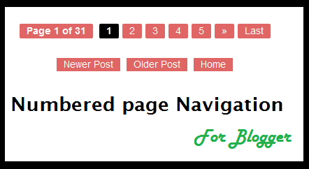
Numbered Page Navigation For Blogger With Css Hover Effect


Numbered

This is awesome page navigation for blogger with Css hover effect even I am also using this widget for my blog you can see this at last of my blog.

This only don't add numbered but i also modify post older,home and newer links.

To add this widget to your blog follow below steps-


Step 1


  1. Go to Design > Edit HTML > Check mark Expand Widget Templates and Find <b:includable id='mobile-index-post' var='post'>
  2. Paste below code before the above line.

<b:includable id='page-navi'>
<div class='pagenavi'>
<script type='text/javascript'>
var pageNaviConf = {
perPage: 7,numPages: 5,firstText: &quot;First&quot;,
lastText: &quot;Last&quot;,
nextText: &quot;&#187;&quot;,
prevText: &quot;&#171;&quot;
}
</script>
<script src='http://awesome-navigation.googlecode.com/files/onlinetrick.js' type='text/javascript'/>
<div class='clear'/>
</div>
</b:includable>


Step 2


  1. Now Find This Code <b:include name='nextprev'/>
  2. Replace <b:include name='nextprev'/>  code with following code.


<b:if cond='data:blog.pageType == &quot;index&quot;'>
<b:include name='page-navi'/>
<b:else/>
<b:if cond='data:blog.pageType == &quot;archive&quot;'>
<b:include name='page-navi'/>
</b:if>
<b:else/>
<b:if cond='data:blog.pageType == &quot;item&quot;'>
<b:include name='nextprev'/>
</b:if>
</b:if>


Step 3


  1. Find ]]></b:skin> and copy the below code and paste before the ]]></b:skin>


#blog-pager, .pagenavi {
     clear: both;
     text-align: center;
     margin: 30px auto 10px;
}
#blog-pager a, .pagenavi span, .pagenavi a {
     margin: 0 5px 0 0;
     padding: 2px 10px 3px;
     text-decoration: none;
     color: #fff;
     background: #e06666;
     -moz-border-radius: 2px;
     -khtml-border-radius: 2px;
     -webkit-border-radius: 2px;
     border-radius: 2px;
-webkit-transition: all .3s ease-in;
-moz-transition: all .3s ease-in;
-o-transition: all .3s ease-in;
transition: all .3s ease-in;
}
#blog-pager a:visited, .pagenavi a:visited {
     color: #fff;
}
#blog-pager a:hover, .pagenavi a:hover {
     color: #fff;
     text-decoration: none;
     background: #000;
}
#blog-pager-older-link, #blog-pager-newer-link {
     float: none;
}
.pagenavi .current {
     color: #fff;
     text-decoration: none;
     background: #000;
}
.pagenavi .pages, .pagenavi .current {
     font-weight: bold;
}
.pagenavi .pages {
     color: #fff;
     background: #e06666;
}

Now Click Save Template and enjoy!!! 


Comment if you like this post

Tuesday, 12 June 2012

New Facebook Popout Likebox Version 3

Click Me

Hover above image to see live demo it is just wesome widget for blogger.I already give you this type of widget for blogger.But now a day's every one is adding same link box to there blog so I decided to give you some thing different.

You can also try this for other social media like-

  1. Twitter
  2. Pinterest
  3. Facebook old One
  4. Google Plus


Installing


  • Go to Design-> Page Elements Click on Add Gadget.
  • Select HTML/Javascript from it
  • Leave title as blank ,Copy and Paste the below code into the content section.

<script type="text/javascript">
/*<![CDATA[*/
jQuery(document).ready(function() {jQuery(".noopslikebox").hover(function() {jQuery(this).stop().animate({right: "0"}, "medium");}, function() {jQuery(this).stop().animate({right: "-250"}, "medium");}, 500);});
/*]]>*/
</script>
<style type="text/css">
.noopslikebox{background: url("https://blogger.googleusercontent.com/img/b/R29vZ2xl/AVvXsEjz5jnakT9YdjEERd_pUMBVAF1iudmDWwAizqXV3iYx5IVmeGjzL3_8CyhG-G1GYK6raaRM6zmVcb1cEryFsmuUI0gxcz4_BtGi7vEl2FfPO4c-FkZ_yzD098XArpgVuXX9Ah765Ncf6O4/s1600/fb_static+button.jpg") no-repeat scroll left center transparent !important;display: block;float: right;height: 270px;padding: 0 5px 0 46px;width: 245px;z-index: 999;position:fixed;right:-250px;top:20%;}
.noopslikebox div{border:none;position:relative;display:block;}
.noopslikebox span{bottom: 12px;font: 8px "lucida grande",tahoma,verdana,arial,sans-serif;position: absolute;right: 7px;text-align: right;z-index: 999;}
.noopslikebox span a{color: gray;text-decoration:none;}
.noopslikebox span a:hover{text-decoration:underline;}
</style>
<div class="noopslikebox">
    <div>
    <iframe src="http://www.facebook.com/plugins/likebox.php?href=http://www.facebook.com/lordhtml&amp;width=245&amp;colorscheme=light&amp;show_faces=true&amp;connections=9&amp;stream=false&amp;header=false&amp;height=270" scrolling="no" frameborder="0" scrolling="no" style="border: medium none; overflow: hidden; height: 270px; width: 245px;background:#fff;"></iframe>
    </div>
</div>

Replace the RED highlighted text with your Facebook page URL. 

Customize backgrounds colors of Lightbox in blogger with Css


Blogger LightBox

Hey Friends Today i will teach you how to customize light box background color in blogger with Css.This is very helpful post for photography bloggers.

What is light box?

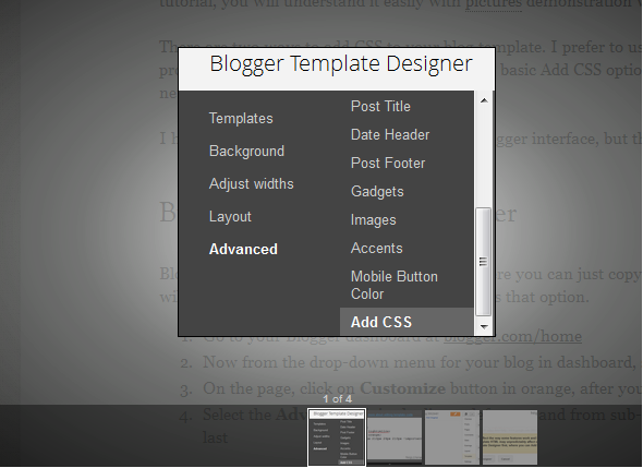
Whenever you are opening any image in blogger then it opens in lightbox and it default color is black but in this post I will teach you how to edit lightbox background.

There's no other customization for the lightbox other than turning it on or off, but believe me as a web designer it's not impossible for me to customize it.


  1. Go to your Blogger dashboard
  2. Now Click On Template Tab.
  3. Now Click On Edit HTML Buton.
  4. Find  ]]></b:skin>
  5. Paste Any of Below Css Code Above It.

Style 1


To Add this style paste below css code there.

.CSS_LIGHTBOX_BG_MASK
{
background-color:gainsboro !important;
background-image:-webkit-radial-gradient(center,rgba(255, 255, 255, 0.83),rgba(63, 65, 63, 0.76),rgba(0, 0, 0, 0.87)) !important;
background-image:-moz-radial-gradient(center,rgba(255, 255, 255, 0.83),rgba(63, 65, 63, 0.76),rgba(0, 0, 0, 0.87)) !important;
}
.CSS_LIGHTBOX_FILMSTRIP {
background-color: rgba(0, 0, 0, 0.411) !important; /* The bottom bar */
}


Style 2


To Add this style paste below css code there.


.CSS_LIGHTBOX_BG_MASK
{
background-color:gainsboro !important;
background-image:-webkit-radial-gradient(center,rgba(255, 255, 255, 0.83),rgba(63, 65, 63, 0.76),rgba(0, 0, 0, 0.87)) !important;
}
.CSS_LIGHTBOX_FILMSTRIP {
background-color: #F0F8FF !important; /* The bottom bar */
}

Style 3


To Add this style paste below css code there.


.CSS_LIGHTBOX_BG_MASK {
background-color: rgba(14, 97, 143, 0.28) !important;
background-image: -webkit-radial-gradient(top,rgba(221, 235, 255, 0.77),rgba(207, 230, 255, 0.6) ,rgba(83, 83, 83, 0.42)) !important;
background-image: -moz-radial-gradient(top,rgba(255, 255, 255, 0.77),rgba(203, 255, 234, 0.6) ,rgba(34, 146, 83, 0.42)) !important;
background-image: -ms-radial-gradient(top,rgba(255, 255, 255, 0.77),rgba(203, 255, 234, 0.6) ,rgba(34, 146, 83, 0.42)) !important;
}
.CSS_LIGHTBOX_FILMSTRIP {
background-color: rgba(101, 122, 231, 0.43) !important;
background-position: 10px 0px;
background-size: 115px 60px;
background-image: -webkit-linear-gradient(315deg,transparent,transparent 33%,rgba(0, 0, 0, 0.12) 33%,rgba(0, 0, 0, 0.12) 66%,transparent 66%,transparent);
background-image: -moz-linear-gradient(315deg,transparent,transparent 33%,rgba(0, 0, 0, 0.12) 33%,rgba(0, 0, 0, 0.12) 66%,transparent 66%,transparent);
background-image: -ms-linear-gradient(315deg,transparent,transparent 33%,rgba(0, 0, 0, 0.12) 33%,rgba(0, 0, 0, 0.12) 66%,transparent 66%,transparent);
-webkit-transition:all 0.6s ease-in-out;
-moz-transition:all 0.6s ease-in-out;
-o-transition:all 0.6s ease-in-out;
-ms-transition:all 0.6s ease-in-out;
transition:all 0.6s ease-in-out;
}
.CSS_LIGHTBOX_FILMSTRIP:hover {
background-color: #7081DA !important;
}
.CSS_LIGHTBOX_FILMSTRIP {
background-color: #A04343; /* The bottom bar */
}

All Credits Go To Deepak Kamat (Author Of Our Blog)

Comment if You Like This Post

Scrolling Popular Post Gadget For Blogger


Blogger

Hey friends this is very good post I am sure you will love this post.In this post I will give you two method by which you can make your blog simple popular post widget into animated scrolling popular post widget.This both popular post widgets are very cool change automatically with nice css effect.This Widget is made by Abu Farhan and Mohammad Mustafa Ahmedzai.You should follow below steps carefully because many other blogger face problem while adding codes.If you don't know basic of adding codes then see this post (How to find code in blogger)


Scrolling Popular Post Widget Style 1


  1. Go To Blogger >>> Design
  2. Click add a gadget
  3. Choose Popular Posts Widget provided by blogger
  4. Keep post number greater than 4
  5. Save your widget
  6. Now select an HTML/Javascript widget
  7. Paste the following slide code inside it,


<style type="text/css" media="screen">
#PopularPosts1 {
overflow:hidden;
margin-top:5px;
width:100%;
padding:0px 0px;
height:310px;
}
#PopularPosts1 ul {
width:310px; 
overflow:hidden;
list-style-type: none;
padding: 0px 0px;
margin:10px 0px 0px 10px;
}
#PopularPosts1 li {
 width:290px; 
padding: 5px 5px;
margin:0px 0px 5px 0px;
list-style-type:none;
float:none;
height:80px;
overflow: hidden;
background:#fff url(https://blogger.googleusercontent.com/img/b/R29vZ2xl/AVvXsEjHlwLMb4IjMNNid1E2vj7BpGzeG8x44SOghfeypM1fiYGaFoXjsvlG5xNrJObwTd2h9avK_J38qMGKhHfKSMGBn6sJQe-nivocsNaKpyxJIyX6X_YP5YOommoxEzf932x8KGkNuunxY8U/s400/popular+posts.jpg) repeat-x;
border:1px solid #ddd;
}
#PopularPosts1 li .item-title {
 
    font-size:1em;
    margin-bottom:0.5em;
}
#PopularPosts1 li .item-title a {
text-decoration:none;
color:#7CA2C4;
font:bold 12px verdana; 

height:18px;
overflow:hidden;
margin:0px 0px;
padding:0px 0px 2px 0px;
}
#PopularPosts1 li img {
float:left;
margin-right:5px;
background:#EFEFEF;
border:2px solid #7CA2C4; 
}
#PopularPosts1 li .item-snippet {
  overflow:hidden;
font-family:Tahoma,Arial,verdana, sans-serif;
font-size:10px;
color:#289728;
padding:0px 0px;
margin:0px 0px;
}
#PopularPosts1 .item-snippet a,
#PopularPosts1 .item-snippet a:visited {
    color:#3E4548;
    text-decoration: none;
}
#PopularPosts1 .spyWrapper {
    height: 100%;
    overflow: hidden;
    position: relative;
}
#PopularPosts1 {
    -webkit-border-radius: 5px;
    -moz-border-radius: 5px;
}
.tags span,
.tags a {
    -webkit-border-radius: 8px;
    -moz-border-radius: 8px;
}
a img {
    border: 0;
}
-->
</style>
<script src="http://ajax.googleapis.com/ajax/libs/jquery/1.6.2/jquery.min.js" type="text/javascript"></script>
<script type="text/javascript" charset="utf-8">
$(function () {
    $('.popular-posts ul').simpleSpy();
});
</script>
<script src="http://accordion-for-blogger.googlecode.com/svn/trunk/simplespy.js" type="text/javascript"></script>


Keep the two widgets together. One on top of another as shown below,   

Keep Both Widget Together


Scrolling Popular Post Widget Style 2


  1. Go To Blogger >>> Design
  2. Click add a gadget
  3. Choose Popular Posts Widget provided by blogger
  4. Keep post number greater than 4
  5. Save your widget
  6. Now select an HTML/Javascript widget
  7. Paste the following slide code inside it,


<style type="text/css" media="screen">
#PopularPosts1 {
 overflow:hidden;
margin-top:5px;
padding:0px 0px;
height:400px;
}
#PopularPosts1 ul {
width:220px;
overflow:hidden;
list-style-type: none;
padding: 0px 0px;
margin:0px 0px;
}
#PopularPosts1 li {
 width:208px;
padding: 5px 5px;
margin:0px 0px 5px 0px;
list-style-type:none;
float:none;
height:80px;
overflow: hidden;
background:#fff url(http://i879.photobucket.com/albums/ab351/bloggerblogimage/blogger/post.jpg) repeat-x;
border:1px solid #ddd;
}
#PopularPosts1 li .item-title {
    color:#A5A9AB;
    font-size:1em;
    margin-bottom:0.5em;
}
#PopularPosts1 li .item-title a {
 text-decoration:none;
color:#4B545B;
font-size:11px;
height:18px;
overflow:hidden;
margin:0px 0px;
padding:0px 0px 2px 0px;
}
#PopularPosts1 li img {
 float:left;
margin-right:5px;
background:#EFEFEF;
border:0;
}
#PopularPosts1 li .item-snippet {
  overflow:hidden;
font-family:Tahoma,Arial,verdana, sans-serif;
font-size:10px;
color:#262B2F;
padding:0px 0px;
margin:0px 0px;
}
#PopularPosts1 .item-snippet a,
#PopularPosts1 .item-snippet a:visited {
    color:#3E4548;
    text-decoration: none;
}
#PopularPosts1 .spyWrapper {
    height: 100%;
    overflow: hidden;
    position: relative;
}
#PopularPosts1 {
-webkit-border-radius: 5px;
-moz-border-radius: 5px;
}
.tags span,
.tags a {
-webkit-border-radius: 8px;
-moz-border-radius: 8px;
}
a img {
    border: 0;
}
-->
</style>
<script src="http://ajax.googleapis.com/ajax/libs/jquery/1.6.2/jquery.min.js" type="text/javascript"></script>
<script type="text/javascript" charset="utf-8">
$(function () {
    $('.popular-posts ul').simpleSpy();
});
</script>
<script src="http://accordion-for-blogger.googlecode.com/svn/trunk/simplespy.js" type="text/javascript"></script>


Keep the two widgets together. One on top of another as shown below,   


Comment If You Like This Post

How to Disable Right click in Blogger

Right Click Disable

It will help you to protect your blog from copyright.Many news website disable right click on there website by which no one can copy there content.If you blog is also related to big articles or books then you should add this to your blog.

I want to add this on my blog but if I add this to my blog how you will copy the codes :).


Installing 


To Disable Right Click In Your Blog Click On Below Button                   


Powered By- Lord HTML

Now when you will try to do right click, a message will tell you that �Function disabled�.

Comment if You Like This  Post


Multi-Color Link Hover Effect for Blogger


Multicolored
It will help you to decorate your blog.It is very colorful with nice hover effect.

Whenever any visitor will mouse over any link in your blog then this color automatically changes every second.

This widget is made by using java/script but you don't need to do anything just add this widget to your blog by our latest widget generator tool.


Installing


No Need to Copy And Paste Code I will make your work easy just click on add to blogger button and it will automatically add this widget to blogger.


To Add Multicolored Link Widget To Your Blog Click On Below Button                   


Powered By- Lord HTML


Please Comment below if you love this post

Monday, 11 June 2012

Recent Comments Widget For Blogger With Avatar


Hii Friends in this post I will give you recent comment widget for blogger.

The good thing about this widget that it containing Avatar which make it more attractive.

It will help you to increase comments on your blog But How???

If you will put this on your blog then visitor want to see there comment on blog home so they will try to comment more and more.


Installing


No Need to Copy And Paste Code I will make your work easy just click on add to blogger button and it will automatically add this widget to blogger.


To Add Recent Comments Widget To Your Blog Click On Below Button                   


Powered By- Lord HTML


Please Comment below if you love this post

MBT Like Auto Scrolling Sticky Bar? With Close Button


Blogger Tricks


MBT full form is My Blogger Tricks.many other blogger just try to cheat this blog as i saw many blogger make there template same like MBL it is very irritating.

Recentally MBT add Auto scrolling bar to there header if you also want to add Sticky bar like that then in this post I will tell you How To add.

 To See Live preview of this sticky bar click on below Live Demo Button.


Step 1


Go To Blogger Dashboard>> Edit HTML >> Proceed

Now Search ]]></b:skin>

Add below Code above ]]></b:skin>

#mbl_bar{background:#333 url('https://blogger.googleusercontent.com/img/b/R29vZ2xl/AVvXsEgwd_DmCuwp9CFxEHoIHtyAMo-21WbQZ8agJGYjxfSgZfHwmRSg4AKC0PK5bCNN6vZ7DngLu5hDITgYmMBRi3QrW3fr2dwWLJVEJvM7sd6xXWVH96759W4bXhPQRZRLB4jR67ONLt4KRA4/s400/stickybar.png') repeat-x;width:100%;margin:0 auto;text-align:center;padding:0px 0;border-bottom: 1px solid #888888;-moz-box-shadow: #666666 0px 1px 3px;-webkit-box-shadow: #666666 0px 1px 3px;box-shadow: #666666 0px 1px 3px;z-index: 999;height: 28px; position:fixed;line-height: 1.85em;vertical-align: baseline;letter-spacing: 1px;color:#fff;font-size:13px;font-weight:bold;font-family: arial,"Helvetica",sans-serif;}#mbl_bar a{text-decoration:underline;color:#E2E504;}#mbl_bar a:hover{text-decoration:none;}#mbl_bar p {margin:0; list-style:none;}#mbl_bar img {vertical-align: middle;margin-right: 6px;}


Step 2


Now Search </head> and paste below code above it.

<script type='text/javascript'>//<![CDATA[var mbl_arr = new Array();var mbl_clear = new Array();function mblFloat(mbl) {mbl_arr[mbl_arr.length] = this;var mblpointer = eval(mbl_arr.length-1);this.pagetop = 0;this.cmode = (document.compatMode && document.compatMode!="BackCompat") ? document.documentElement : document.body;this.mblsrc = document.all? document.all[mbl] : document.getElementById(mbl);this.mblsrc.height = this.mblsrc.offsetHeight;this.mblheight = this.cmode.clientHeight;this.mbloffset = mblGetOffsetY(mbl_arr[mblpointer]);var mblbar = 'mbl_clear['+mblpointer+'] = setInterval("mblFloatInit(mbl_arr['+mblpointer+'])",1);';mblbar = mblbar;eval(mblbar);}function mblGetOffsetY(mbl) {var mtaTotOffset = parseInt(mbl.mblsrc.offsetTop);var parentOffset = mbl.mblsrc.offsetParent;while ( parentOffset != null ) {mblTotOffset += parentOffset.offsetTop;parentOffset = parentOffset.offsetParent;}return mblTotOffset;}function mblFloatInit(mbl) {mbl.pagetop = mbl.cmode.scrollTop;mbl.mblsrc.style.top = mbl.pagetop - mbl.mbloffset + "px";}function closeTopAds() {document.getElementById("mbl_bar").style.visibility = "hidden";}//]]></script>


Step 3


Now Search </body> and paste below code above it.


<div id='mbl_bar'> Your Text And Links Will Be Written Here<span style='padding:0px; float:right'><img align='absmiddle' border='0' onClick='closeTopAds();return false;' src='https://blogger.googleusercontent.com/img/b/R29vZ2xl/AVvXsEi-ytVU-hedK1DshaHMw13JEJJSrAOs0AMBvBQIWdOfJI4NZrWJqv3Rdbq1VoevJXMqkYSCJbC0NqD9WGJm4EsK_xYr1Lqa70K__-BSxNUNSJcSd-cc_scz5icn-GqXPKnMR6G5yxgitME/s400/cancel.png' style='cursor:hand;cursor:pointer;'/></span></div><br/><br/>


Now Replace the work which I highlighted with red and save the template.

Enjoy!!!

Comment Is Best Way To Say Thanks


Saturday, 9 June 2012

Peel effect Rss Subscription Widget For Blogger

You may see this peel effect to many other blogs,I just edited it and add feed burner icon + link inside it.

How it work?

After installing this widget to your blog,it will start appearing top right corner of your blog,when some one mouse over it the peel effect will start and subscription icon will shows.

In this Post i will teach You how to add this peel effect Rss Subscription widget to blogger.


Live Demo


Follow Below Steps to add this widget to your blog.


Step 1


Add jQuery plugin (if your blog have a jquery plugin,ignore this step)

  • Go to blogger dashboard.
  • Click on Template>>>Edit Html.
  • Now search </head>
  • Copy And paste below Code Above </head> code.

<script src='http://ajax.googleapis.com/ajax/libs/jquery/1.7.1/jquery.min.js' type='text/javascript'/>


Steps 2


  • Go to blogger Dashboard.
  • Click on Template>>>Edit Html.
  • Now search </head>
  • Copy And paste below Code Above </head> code.

<style type='text/css'>img { behavior: url(iepngfix.htc) }#pageflip {position: absolute;right: 0; top: 0;float: right;}#pageflip img {width: 50px; height: 52px;z-index: 99;position: absolute;right: 0; top: 0;-ms-interpolation-mode: bicubic;}#pageflip .back-img {width: 50px; height: 50px;overflow: hidden;position: absolute;right: 0; top: 0;z-index:98;background: url(https://blogger.googleusercontent.com/img/b/R29vZ2xl/AVvXsEglK3DCr6wcq0M27ckQSw-EyUjc84U_Nc2Sud6dkQWYBwfbkS5-LzUTgMd4Jwtz9O2WHr2UdUeI6kMUMIQUtu1A-EbXXg0ciHaPF1cDpMQP-a2WkVOFUW3JYZ_7mG2OiwxcscjHyon3TbA/s200/rss+netoops+blog+page+peel.png) no-repeat right top #fff;}</style><a href='http://netoopsblog.blogspot.com'><img src='https://blogger.googleusercontent.com/img/b/R29vZ2xl/AVvXsEiOh_xs3W8wjCNiStJ0r7wsF1CEr4-CYgkT_hY-tOkhxae1bEl-P8tMiqBDABG08zsuSPyHbjBxLmVOV9ySkQqrewcZI92DwqoIhApxxLUuifdF-v3WaxWkZYlfxq47Cu_yPyIbmK76Mac/s1600/1x1juice.png'/></a><script type='text/javascript'>$(document).ready(function(){//Page Flip on hover$(&quot;#pageflip&quot;).hover(function() {$(&quot;#pageflip img , .back-img&quot;).stop().animate({width: &#39;307px&#39;,height: &#39;319px&#39;}, 500);} , function() {$(&quot;#pageflip img&quot;).stop().animate({width: &#39;50px&#39;,height: &#39;52px&#39;}, 220);$(&quot;.back-img&quot;).stop().animate({width: &#39;50px&#39;,height: &#39;50px&#39;}, 200);});});</script>

Step 3


  • Go To Blogger Dashboard.
  • Click on Template>>>Edit Html.
  • Now Search </body>
  • Copy And paste below Code Above </body> code.

<div id='pageflip'><a href=' http://feeds.feedburner.com/lordhtml '><img alt='netoops blog' src='https://blogger.googleusercontent.com/img/b/R29vZ2xl/AVvXsEjxJdGMDPdhrHQfLRy1_umuFigqcOyUbGRFM4U2sr2Ezbw8rGTBKeXwE7BuAP6VDC8Y8BwqDywSlQLtykD3mJABZsa61nhcpbUm_XufQBUNyRuBb99g-aXmIIxhP3bvOY47aL7NQIh3Rbr5/s1600/page_flip.png'/></a><div class='back-img'/></div>

Now save Template.


You're Done!!! If Any Problem Feel Free To Comment

Spraying Animated Subscription Buttons for Blogger


Spraying Animated Subscription Buttons for Blogger

In my previous post I gave you Sexy Hover Effect Social Media Sidebar Button It is similar widget like this but only the difference is that i work very smooth.

How It Works?

When you will install it to your blog then it will appear on right corner of your blog whenever any visitor will click on it smoothly all icons will come out.

This animated subscription buttons created by Redeyeoperations


Step 1


  • Go to blogger dashboard
  • Go to Template->Edit HTML
  • Now Search <head>
  • Now Copy the below code and paste it after <head> code

<script src='http://ajax.googleapis.com/ajax/libs/jquery/1.7.1/jquery.min.js' type='text/javascript'/>


Step 2


Copy the below code and paste it in Html/Javascript of your blog.

<style type="text/css">#circle-mod{bottom: 0 !important;left: 5px !important;position: fixed;}#container-circle{position:relative;height:100px;width:100px}#base-button{background:-moz-linear-gradient(center top,#A90329 0,#8F0222 44%,#6D0019 100%) repeat scroll 0 0 #6D0019;background:-webkit-linear-gradient(top,#a90329 0,#8f0222 44%,#6d0019 100%);background:-o-linear-gradient(top,#a90329 0,#8f0222 44%,#6d0019 100%);background:-ms-linear-gradient(top,#a90329 0,#8f0222 44%,#6d0019 100%);background:linear-gradient(top,#a90329 0,#8f0222 44%,#6d0019 100%);border:4px solid #fff;text-decoration: none;z-index:9999;cursor:pointer;border-radius:50px 50px 50px 50px;box-shadow:0 1px 3px rgba(0,0,0,0.5);color:#fff;font:68px Arial;height:80px;left:0;padding:0;position:absolute;text-align:center;top:0;width:80px}.btn{position:absolute;height:50px;width:50px;border-radius:25px;top:15px;left:15px;-webkit-transition:all 250ms;-moz-transition:all 250ms;-o-transition:all 250ms;-ms-transition:all 250ms;transition:all 250ms;box-shadow:0 1px 3px rgba(0,0,0,.5)}#netoopsblog-fb.open{top:-125px;left:25px}#netoopsblog-fb.open.clicked{top:-135px;left:15px}#netoopsblog-tw.open{top:-105px;left:80px}#netoopsblog-gplus.open{top:-75px;left:125px}#netoopsblog-rss.open{top:-30px;left:160px}#netoopsblog-mail.open{left:175px;top:25px}.plus{-moz-user-select: none;-moz-transition:all 200ms ease-in 0s;-webkit-transition:all 200ms ease-in;-o-transition:all 200ms ease-in}.rot{-moz-transform:rotate(137deg);-o-transform:rotate(137deg);-webkit-transform:rotate(137deg);transform:rotate(137deg)}</style><script type="text/javascript">var delay=40,delayTime;$(function(){btns=$(".btn");$("#base-button").toggle(function(){$("span.plus").addClass("rot");btns.each(function(a){var b=$(this);delayTime=a*delay;window.setTimeout(function(){b.addClass("open")},delayTime)})},function(){$("span.plus").removeClass("rot");$($(btns).get().reverse()).each(function(a){var b=$(this);delayTime=a*delay;window.setTimeout(function(){b.removeClass("open")},delayTime)})})});</script><a href="http://netoopsblog.blogspot.com" style="position:absolute;z-index:-11"><img src="https://blogger.googleusercontent.com/img/b/R29vZ2xl/AVvXsEiOh_xs3W8wjCNiStJ0r7wsF1CEr4-CYgkT_hY-tOkhxae1bEl-P8tMiqBDABG08zsuSPyHbjBxLmVOV9ySkQqrewcZI92DwqoIhApxxLUuifdF-v3WaxWkZYlfxq47Cu_yPyIbmK76Mac/s1600/1x1juice.png" /></a><div id="circle-mod"><div id="container-circle"><a id="netoopsblog-fb" class="btn" style="background:url(https://blogger.googleusercontent.com/img/b/R29vZ2xl/AVvXsEjm6lRKL5MSKL0KVoWQhJnSHQaiq-nwA0lIBloPG9LVndHyZGi_JqI-V89Pasppl6OMyxxjuHD6KKQYKtswbzaKVJOxzQLQCga4iPK013TtF1ldbaVBkRtzvzAUn8I89wi2E2bhvOHW7v4/s1600/netoopsblog_share+buttons2.png) repeat -1px 0" href="http://www.facebook.com/lordhtml" rel="nofollow" target="_blank"></a><a id="netoopsblog-tw" class="btn" style="background:url(https://blogger.googleusercontent.com/img/b/R29vZ2xl/AVvXsEjm6lRKL5MSKL0KVoWQhJnSHQaiq-nwA0lIBloPG9LVndHyZGi_JqI-V89Pasppl6OMyxxjuHD6KKQYKtswbzaKVJOxzQLQCga4iPK013TtF1ldbaVBkRtzvzAUn8I89wi2E2bhvOHW7v4/s1600/netoopsblog_share+buttons2.png) repeat -52px 0" href="http://twitter.com/technologyblg" rel="nofollow" target="_blank"></a><a id="netoopsblog-gplus" class="btn" style="background:url(https://blogger.googleusercontent.com/img/b/R29vZ2xl/AVvXsEjm6lRKL5MSKL0KVoWQhJnSHQaiq-nwA0lIBloPG9LVndHyZGi_JqI-V89Pasppl6OMyxxjuHD6KKQYKtswbzaKVJOxzQLQCga4iPK013TtF1ldbaVBkRtzvzAUn8I89wi2E2bhvOHW7v4/s1600/netoopsblog_share+buttons2.png) repeat -157px 0" href="https://plus.google.com/u/0/113143762085765715608" rel="nofollow" target="_blank"></a><a id="netoopsblog-rss" class="btn" style="background:url(https://blogger.googleusercontent.com/img/b/R29vZ2xl/AVvXsEjm6lRKL5MSKL0KVoWQhJnSHQaiq-nwA0lIBloPG9LVndHyZGi_JqI-V89Pasppl6OMyxxjuHD6KKQYKtswbzaKVJOxzQLQCga4iPK013TtF1ldbaVBkRtzvzAUn8I89wi2E2bhvOHW7v4/s1600/netoopsblog_share+buttons2.png) repeat -105px 0" href="http://feeds.feedburner.com/lordhtml" rel="nofollow" target="_blank"></a><a id="netoopsblog-mail" class="btn" style="background:url(https://blogger.googleusercontent.com/img/b/R29vZ2xl/AVvXsEjm6lRKL5MSKL0KVoWQhJnSHQaiq-nwA0lIBloPG9LVndHyZGi_JqI-V89Pasppl6OMyxxjuHD6KKQYKtswbzaKVJOxzQLQCga4iPK013TtF1ldbaVBkRtzvzAUn8I89wi2E2bhvOHW7v4/s1600/netoopsblog_share+buttons2.png) repeat -210px 0" href="http://feedburner.google.com/fb/a/mailverify?uri=lordhtml" rel="nofollow" target="_blank"></a><a id="base-button"><span class="plus">+</span></a></div></div><a href="http://netoopsblog.blogspot.com" rel="dofollow"></a>

Now replace the link which I highlighted with red color with your social media link.

 Comment Is Best way to say Thanks....:)

Smooth Jquery Scroll to Top widget For Blogger


Smooth Jquery Scroll to Top widget

Hey friends today i will give you amazing Smooth Jquery Scroll to Top widget it is best scroll to top button for blogger.

Why it is best?

It is best because it is having smooth go to top effect also i added css mouseover effect to it, by which whenever you will put your mouse over it,It will increase it side.


Installation


Copy the below code and paste it in html/javacript of your blog.

<script src='http://ajax.googleapis.com/ajax/libs/jquery/1.7.1/jquery.min.js' type='text/javascript'></script><script type='text/javascript'>$(function(){$(window).scroll(function(){if($(this).scrollTop()!=0){$("#noop-top").fadeIn()}else{$("#noop-top").fadeOut()}});$("#noop-top").click(function(){$("body,html").animate({scrollTop:0},800);return false})});</script><a href="http://netoopsblog.blogspot.com"></a><a id='noop-top' style='display: none; position: fixed; bottom: 1px; right:1%; cursor:pointer;font:12px arial;'><span>^</span></a><style type="text/css">#noop-top span{-moz-transition:all .3s ease-in 0s;-webkit-transition:all .3s;-o-transition:all .3s;background-color:#1e5799;background:-moz-linear-gradient(top,#1e5799 0,#2989d8 50%,#207cca 51%,#7db9e8 100%);background:-webkit-gradient(linear,left top,left bottom,color-stop(0%,#1e5799),color-stop(50%,#2989d8),color-stop(51%,#207cca),color-stop(100%,#7db9e8));background:-webkit-linear-gradient(top,#1e5799 0,#2989d8 50%,#207cca 51%,#7db9e8 100%);background:-o-linear-gradient(top,#1e5799 0,#2989d8 50%,#207cca 51%,#7db9e8 100%);background:-ms-linear-gradient(top,#1e5799 0,#2989d8 50%,#207cca 51%,#7db9e8 100%);background:linear-gradient(top,#1e5799 0,#2989d8 50%,#207cca 51%,#7db9e8 100%);border:3px solid #fff;border-radius:14px 14px 14px 14px;color:#fff;font:bold 56px cursive;height:50px;left:3px;display:block;text-align:center;text-shadow:1px 1px 0 #000;top:-56px;width:50px}#noop-top:hover span{box-shadow:0 0 49px #207cca;height:70px}#noop-top{color:#000;text-shadow:1px 1px 0 #fff;text-decoration:none}</style>/>

Now just save it and play with this awesome hover effect button :) 

Search Box Collection For Blogger

search box

Hey friends today i will show you how to add beautiful search box to your blog,I am having 4 good looking search box right now so I will share this with you in this post.

For adding any search box you like below just copy the code and paste it in html/javascript and save it.


Simple Cool Css


simple and cool

<div class='topsearch'>  <div class='clerfix' id='search'>      <form action='/search' id='searchform' method='get'>          <input id='s' name='q' onblur='if (this.value == &quot;&quot;) {this.value = &quot;Search here...&quot;;}' onfocus='if (this.value == &quot;Search here...&quot;) {this.value = &quot;&quot;}' type='text' value='Search here...'/>          <input class='search-image' src='https://blogger.googleusercontent.com/img/b/R29vZ2xl/AVvXsEjmT5WLHOWC5KZKuokYY_5G9IaMlzOH1mEROcydJuwceEykmVZ1qw6wVdBltaIO1spWl63SpI41Y2etOXTfFkr6tuiW-mXbbfCZw-dknvJC43mtgsSrynZD9ntTn_eOgk0RpokMhk4Qjkc/s1600/search.png' title='Search' type='image'/>      </form>  </div>
<style>
#search{width:300px; margin-left: 10px; border:1px solid #E0DFD9;background:url(https://blogger.googleusercontent.com/img/b/R29vZ2xl/AVvXsEh1NGMDDOrEVlCPlRoVrAO5csAw-cDRpACh5GwgUMGbJbS__SRC2kmvDULsn8bURAWoSdeq2SxxheB7Ty1DLM2TzpkTChdefxUSfVcm6ljLgZUfvJLv_lUwP5m-YC9wII_QWWBBvEYwYcQ/s1600/search-bg.png) left top repeat-x;height:32px;padding:0;text-align:left;overflow:hidden}
#search #s{width:80%; background:none;color:#3F3F3F;border:0;padding:4px;margin:3px 0 0 12px;float:left}
#search .search-image{border:0;vertical-align:top;float:right;margin:8px 4px 0 2px}
#search-wrap{padding:15px 0}
.topsearch #search{margin-top:0;margin-bottom:10px}
</style></div>


Sleek and Cool


sleek and cool

<style type="text/css">
#abt-searchbox{
border-radius:5px;
background:URL(https://blogger.googleusercontent.com/img/b/R29vZ2xl/AVvXsEgHjeevJ4kqGLlJXWaP2jCAZ57LE6Q6TYE1Dyx7UfAeXhXS1-5qv42iHHHpkbNFfPaXr3DUvury_DFKUJ3aXknC__-zWkHrOGggC-02LR6yBOypzp4qYziQ0GmQIf9kbYrQUfVqfUNdJGo/s1600/black.png) no-repeat scroll center center transparent;width:307px;height:50px;disaply:block;}
form#abt-searchform{display: block;padding: 10px 12px;margin:0;}
form#abt-searchform #s{padding-left:16px !important; padding:7.5px;margin:0;width: 235px;font-size:14px;vertical-align: top;border:none;background:transparent;}
form#abt-searchform
#sbutton{margin:0;padding:0;height:40px; width:44px;vertical-align: top;border:none;background:transparent;}
</style>
<div id="abt-searchbox">
<form id="abt-searchform" action="/search" method="get">
    <input type="text" id="s" name="q" value="Search..." onfocus='if (this.value == "Search...") {this.value = ""}' onblur='if (this.value == "") {this.value = "Search...";}'/>
    <input type="image" src="http://img1.blogblog.com/img/blank.gif" id="sbutton" />
</form>
</div>


Sleek And Cool Style 2


sleek and cool style 2


<style type="text/css">
#abt-searchbox{
border-radius:5px;
background:URL(https://blogger.googleusercontent.com/img/b/R29vZ2xl/AVvXsEjuVLVybkEEShXGDglTdcYUo6z_CN0k11Vffh79VbIj6HnlMkV4sneXBQNiQL2qvIBZnbPO9TVuCysonal2OgGUhY8n2T41pypvRZ_zjLRY69caBAfbHa3d7WC4V6Z0E1Ltt1olpa6T_wA/s400/bluez+by+allbloggingtips.png) no-repeat scroll center center transparent;width:307px;height:50px;disaply:block;}
form#abt-searchform{display: block;padding: 10px 12px;margin:0;}
form#abt-searchform #s{padding-left:16px !important; padding:7.5px;margin:0;width: 235px;font-size:14px;vertical-align: top;border:none;background:transparent;}
form#abt-searchform
#sbutton{margin:0;padding:0;height:40px; width:44px;vertical-align: top;border:none;background:transparent;}
</style>
<div id="abt-searchbox">
<form id="abt-searchform" action="/search" method="get">
    <input type="text" id="s" name="q" value="Search..." onfocus='if (this.value == "Search...") {this.value = ""}' onblur='if (this.value == "") {this.value = "Search...";}'/>
    <input type="image" src="http://img1.blogblog.com/img/blank.gif" id="sbutton" />
</form>
</div>


Beautiful and Fresh


fresh


<style type="text/css">
#w2b-searchbox{background:url(https://blogger.googleusercontent.com/img/b/R29vZ2xl/AVvXsEhgYHl2upiMr4xQlrA2HF4T2l75sBiFN0HtgEd3wh6Vuoq42qPTvD5oUM78AStUjtiluxPsLHYjsndFlWZPWHvett0OqXmGApD94KvXAJhjw7wMAXGOXn9w-b4wCw4c2jWgwkSN2_3Sk_8c/) no-repeat scroll center center transparent;width:307px;height:50px;disaply:block;}
form#w2b-searchform{display: block;padding: 12px;margin:0;}
form#w2b-searchform #s{padding: 6px 6px 6px 26px;margin:0;width: 215px;font-size:14px;vertical-align: top;border:none;background:transparent;}
form#w2b-searchform #sbutton{margin:0;padding:0;height:30px;width:30px;vertical-align: top;border:none;background:transparent;}
</style>
<div id="w2b-searchbox">
<form id="w2b-searchform" action="/search" method="get">
    <input type="text" id="s" name="q" value=""/>
    <input type="image" src="http://img1.blogblog.com/img/blank.gif" id="sbutton" />
</form>
</div>


Dashing Red


dashing red


<style type="text/css">
#w2b-searchbox{background:url(https://blogger.googleusercontent.com/img/b/R29vZ2xl/AVvXsEiPJKUDetQa0nphTQD4bVmWMhzunc-RSwfpdaRqSgLbEKlSgracngdl3foQb4j5nbeJjBXIlpE4KDAF3hiU3m2d15VW3QNlRTb87suZXVLR1K_k6t5ZgQ-Sm8W4k9Bu76yA3PP5Z-46idz7/) no-repeat scroll center center transparent;width:307px;height:50px;disaply:block;}
form#w2b-searchform{display: block;padding: 10px 12px;margin:0;}
form#w2b-searchform #s{padding: 6px;margin:0;width: 235px;font-size:14px;vertical-align: top;border:none;background:transparent;}
form#w2b-searchform #sbutton{margin:0;padding:0;height:30px;width:30px;vertical-align: top;border:none;background:transparent;}
</style>
<div id="w2b-searchbox">
<form id="w2b-searchform" action="/search" method="get">
    <input type="text" id="s" name="q" value="Search..." onfocus='if (this.value == "Search...") {this.value = ""}' onblur='if (this.value == "") {this.value = "Search...";}'/>
    <input type="image" src="http://img1.blogblog.com/img/blank.gif" id="sbutton" />
</form>
</div>


Tuesday, 5 June 2012

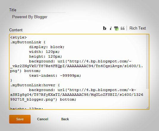
Customize Powered By Blogger With Css

I seen Many blogger to modify there powered by blogger,I don't modify it on my blog but i am having way to madify it.

If you want to change it and make it more attractive then today I will teach you this.

This widget is made by Me (Aumkar Thakur) with lot of coding i use html,Css and finally java/script to complete this widget.


Installing


  • Go To Blogger Dahboard
  • Click On Layout Tab
  • Add Html/Javacript
  • Paste Below Code There.

<style>
.myButtonLink {
display: block;
width: 120px;
height: 120px;
background: url('https://blogger.googleusercontent.com/img/b/R29vZ2xl/AVvXsEiJktptoeEG9c_2crkrUkOBVhY9IF2bkjPmWHEy7hPQcYEX15IjCZuB1Y24APyOjyyffT84KOD8U-hGZpORIaaV8qfgTEIl9glG9j-8PiUnv2j4KOLM5v04novQeWBC4fp91PV1oI-zzAA/s1600/1.png') bottom;
text-indent: -99999px;
}
.myButtonLink:hover {
        background: url('https://blogger.googleusercontent.com/img/b/R29vZ2xl/AVvXsEje6NoDk6c_rKlFtlaL1nvkKiGQIx3iJqzBrFFAiaTgjCtPNIrj0yfoCuYxF1gEgER8oKM_65Ly3oIV2E6EWjig5YI2BZbsbTNwkaz6MShLAiTEFtrAfJ_DqWXGqYc8F2SUtVJNRhD8cmM/s1600/1326992718_blogger.png') bottom;
height: 123px;
}
</style>
<a class="myButtonLink" href="http://www.blogger.com">blogger</a>


  • Give Title And Save It.
It Should Look Like This- 


  • Drag The Gadget To Bottom
.


Removing Default Powered By Blogger


If you added above pawered by blogger and want to delete default powered by blogger which you will find on bottom of your blog,So i am having Css code by which you can remove this in 1 minutes.

To Remove Default powered By Blogger Follow Below Steps-


  • Go To Blogger Dashboard.
  • Click On Template Tab.
  • Now click on customize button.
  • Now Select Add Css.
  • Paste below Code in Add Css Box and Save Template.
#Attribution1 {display: none;}

Save it.

Comment is Best Way To Say Thanks!!! 

Add Cool Nivo Slider to Blogger


There are many slider available in web but nivo slider is latest awesome slider with awesome effect.This Slider is Simple & Clean And With 16 Unique Transition Effect.If you want to add this slider to your blog then you are at right place,Today i will show you How To Add Nivo Slider To Your Blog.


Installation


  • Go To Blogger Dashboard.
  • Click On Layout Tab.
  • Add New Gadget.
  • Select Html/Javascript.
  • Paste The Following Code there and save it.

<style>#slider {
    position: relative;
    border: 5px solid #333;
}

#slider img {
    position: absolute;
    top: 0px;
    left: 0px;
    display: none;
}

#slider a {
    border: 0;
    display: block;
}

.nivo-controlNav {
    position: absolute;
    left: 260px;
    bottom: -42px;
}

.nivo-controlNav a {
    display: block;
    width: 22px;
    height: 22px;
    background: url(https://blogger.googleusercontent.com/img/b/R29vZ2xl/AVvXsEjlKTKx-84Jh0rfWHVpfA3l-Z7AmlE8FoEAsIcdkIzRF7ebQ35hSgzVf7fqwlP1QcXv1p4CB6wMHhpIV4L7InfMBaISnMk965rteGqsrObokg5NvCqmp_8BcTgZNL0s47JkoGSYk3mnhOk/s400/bullets.png) no-repeat;
    text-indent: -9999px;
    border: 0;
    margin-right: 3px;
    float: left;
}

.nivo-controlNav a.active {
    background-position: 0 -22px;
}

.nivo-directionNav a {
    display: block;
    width: 30px;
    height: 30px;
    background: url(https://blogger.googleusercontent.com/img/b/R29vZ2xl/AVvXsEgtvejb3J2DQM5CZxuPH96WgLnrs04tZ5zn_l-G5V6RVv92vXwkYJZFtuDCzwaVs3svEevHT1wAsi7CXyNz12qVN8fugWgGn9qxAoAXc_fYUwXBXBmkr3ji2qYdczmmS3x1IWoYYOTWXBU/s400/arrows.png) no-repeat;
    text-indent: -9999px;
    border: 0;
}

a.nivo-nextNav {
    background-position: -30px 0;
    right: 15px;
}

a.nivo-prevNav {
    left: 15px;
}

.nivo-caption {
    text-shadow: none;
    font-family: Helvetica, Arial, sans-serif;
    font-size: 16px;
    padding: 10px 0px;
}

.nivo-caption a {
    color: #efe9d1;
    text-decoration: underline;
}

.clear {
    clear: both;
}

.nivoSlider {
    position: relative;
}

.nivoSlider img {
    position: absolute;
    top: 0px;
    left: 0px;
}

.nivoSlider a.nivo-imageLink {
    position: absolute;
    top: 0px;
    left: 0px;
    width: 100%;
    height: 100%;
    border: 0;
    padding: 0;
    margin: 0;
    z-index: 60;
    display: none;
}

.nivo-slice {
    display: block;
    position: absolute;
    z-index: 50;
    height: 100%;
}

.nivo-caption {
    position: absolute;
    left: 0px;
    bottom: 0px;
    background: #000;
    color: #fff;
    opacity: 0.7;
 /* Overridden by captionOpacity setting */
    width: 100%;
    z-index: 89;
}

.nivo-caption p {
    padding: 5px;
    margin: 0;
}

.nivo-caption a {
    display: inline !important;
}

.nivo-html-caption {
    display: none;
}

.nivo-directionNav a {
    position: absolute;
    top: 45%;
    z-index: 99;
    cursor: pointer;
}

.nivo-prevNav {
    left: 0px;
}

.nivo-nextNav {
    right: 0px;
}

.nivo-controlNav a {
    position: relative;
    z-index: 99;
    cursor: pointer;
}

.nivo-controlNav a.active {
    font-weight: bold;
}
</style>
<script src="http://code.jquery.com/jquery-latest.min.js"
type="text/javascript"></script>
<script src="http://code.helperblogger.com/jquery.nivo.slider.js"
type="text/javascript"></script>
<script type="text/javascript">
    $(window).load(function () {
        $('#slider').nivoSlider();
    });
</script>
<div id="slider">
     <a href="YOUR LINK HERE"><img src="URL OF IMAGE" alt="" title="ADD DESCRIPTION HERE" /></a>
     <a href="YOUR LINK HERE"><img src="URL OF IMAGE" alt="" title="ADD DESCRIPTION HERE" /></a>
    <a href="YOUR LINK HERE"><img src="URL OF IMAGE" alt="" title="ADD DESCRIPTION HERE" /></a>
   <a href="YOUR LINK HERE"><img src="URL OF IMAGE" alt="" title="ADD DESCRIPTION HERE" /></a>
</div>?

I Love Small Codes :)

If Any Problem Comes Comment below